EverApply Phase 2: Building the Frontend
Phase 1.5 ended with a working API. Jobs were scored. ATS resumes were generating. Proxy endpoints were in place so a browser could actually fetch the PDFs. The backend was ready.
He was still copy-pasting job descriptions into a notes file to keep track of things.
That was the signal. Time to build what he’d actually look at every morning.
The Stack
Before diving into what I built, a quick note on the setup. The frontend is React with TypeScript, TanStack Router for routing, React Query for data fetching, and TanStack Form for anything form-shaped. Tailwind for styles, Framer Motion for animations, Shadcn for the base components, Clerk for auth.
TanStack Router is file-based, which means the folder structure is the route tree. I’d used it on a side project before and liked it. The type-safe navigation alone is worth it compared to the alternatives.
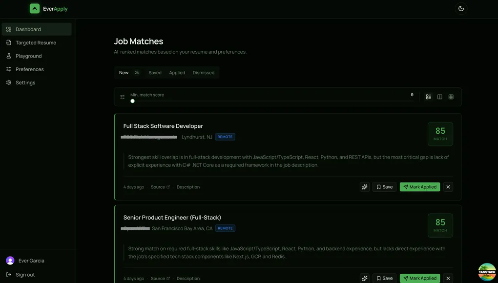
The Dashboard
This is the main screen. It’s what he sees every morning after the pipeline runs.
The layout is four tabs: New, Saved, Applied, and Dismissed. Every match lives in exactly one of those states. The action buttons on each card adapt to the current tab so invalid state transitions aren’t possible. You can’t save an already-saved card, can’t dismiss something that’s already dismissed. The button set just changes based on where you are.
Each card has a color-coded left border tied to the match score: green for 80 and above, yellow for 60 to 79, red below 60. This was a deliberate choice over showing the number first. The color gives you an instant read on quality before your eye reaches the score block. You can scan twenty cards in about three seconds and know which ones are worth reading.
The match reason from the LLM sits below the job title and company. Two-line clamp by default with an expand button if you want the full paragraph. Most of the time the first two lines tell you enough.
Cards animate in and out with Framer Motion. This sounds like polish for its own sake, but there’s a real reason: when you mark something as Applied and it leaves the New tab, you need to see that the action registered. Without animation the card just disappears, which creates a half-second of “did that work?” A short exit animation closes that loop.
The Score Filter
There’s a slider at the top of the dashboard for setting a minimum match score. Drag it to 70 and anything below a 70 disappears from view. The tab labels update to show how many matches are visible at the current threshold, not just the total.
The interesting part is where the value lives. It’s not local state. When you stop dragging, the value gets written back to your user preferences via a mutation. When you come back the next morning, the filter is exactly where you left it. If you decide you want to see more matches that week, you lower it once and it stays there.
The pattern is: immediate UI update for responsiveness, background save for persistence. The slider feels instant because it is instant. The persistence is just a bonus.
Four Resume Tools, Two Surfaces
The backend has four resume generation modes. Putting them all on the same page would be a mess, so I split them across two places based on when you’d actually reach for them.
On the dashboard: Each job card has an ATS resume button. Click it once while viewing a promising match and it generates a resume tailored to that specific job. The first click fires the generation request and shows a loading state with a tooltip that says “Generating ATS resume…” Once it comes back, the icon fills in and changes to “View ATS Resume.” The generated file is cached on the match, so subsequent clicks just open the PDF. No second API call.
A small toast appears after generation showing how many daily generations you have left. I added this because without it, the limit feels arbitrary when you eventually hit it. Knowing “3 of 5 remaining today” gives you a sense of the system.
On the Playground page: This is for the two modes that don’t require a specific match. Toggle off gives you Ideal mode: paste a job description, get back a fictional perfect-candidate resume. No base resume involved. This started as a debugging tool during backend development to verify that the scoring was calibrated correctly, but it turned out to be genuinely useful for understanding what a role is actually asking for before tailoring a real application.
Toggle on gives you Boost mode. This one uses your uploaded resume as the skeleton: name, companies, job titles, dates, education all stay as-is. The AI rewrites the bullets, skills, and summary to match the job description. The structure is real, the language is targeted.
The Targeted Resume page is a standalone version of the ATS flow for jobs you found outside the dashboard. LinkedIn DMs, company career pages, referrals. Paste the description, get your resume tailored to it. It streams the file directly as a download and reads the Content-Disposition header from the response to name the file correctly instead of defaulting to something generic.
Preferences Auto-Save
The Preferences page has the job search filters: work type, location, radius, salary range, minimum score, clearance preference. None of it has a Save button. Every field saves on its own when you interact with it.
Sliders save on value commit (when you stop moving). Text fields save on blur. Toggles save immediately on change. The score slider on the dashboard does the same thing.
This is a small thing but it makes a meaningful difference in feel. Forms with save buttons ask you to remember to confirm changes. Auto-save removes that burden. If you adjust your location and close the tab, the change stuck.
TanStack Form handles the form state. Each field is initialized lazily and saves independently, which means a failed save on one field doesn’t block the others.
Onboarding
First-time users land on a two-step flow before they see anything else. Step one is resume upload: drag-and-drop or file picker, PDF only. After the upload, the API returns parsed resume data including detected skills, job titles, seniority, and years of experience. Step two pre-fills with those values and shows your name in the description so it’s immediately clear the parsing worked.
The second step has the same preference fields as the full Preferences page but simplified for setup context. The location field hides entirely if you select remote-only, since it wouldn’t apply anyway. Submit lands you on the dashboard with your first set of matches already waiting if the pipeline has run since you signed up.
Where It Stands
The full loop is working. Jobs get scraped and scored every morning. He opens the dashboard, sees ranked matches with reasons, generates a tailored resume for anything worth applying to, and marks it as applied when he submits. The Playground gives him tools to understand roles before committing to an application.
The next thing is probably polishing the settings page and wiring up the billing flow that’s been sitting in the backend since Phase 1.5. The infrastructure is there. It just needs the frontend to surface it.
He got two callbacks last week. Not claiming causation, but I’m keeping an eye on it.